Easily add desktop, tablet and mobile friendly columns to your content using an easy to use shortcode.
| Author: | Tom Usborne (profile at wordpress.org) |
| WordPress version required: | 4.5 |
| WordPress version tested: | 5.1.1 |
| Plugin version: | 1.0 |
| Added to WordPress repository: | 20-05-2015 |
| Last updated: | 14-03-2019
Warning! This plugin has not been updated in over 2 years. It may no longer be maintained or supported and may have compatibility issues when used with more recent versions of WordPress.
|
| Rating, %: | 98 |
| Rated by: | 42 |
| Plugin URI: | https://generatepress.com |
| Total downloads: | 114 618 |
| Active installs: | 10 000+ |

Click to start download
|
Screenshots
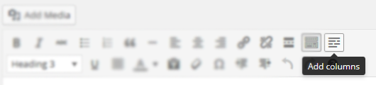
The columns icon in your TinyMCE editor.
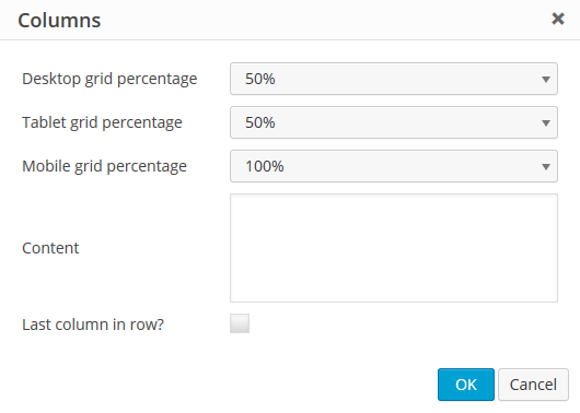
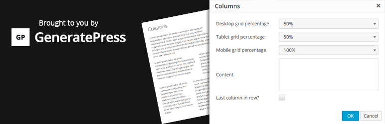
The options inside the columns shortcode generator.
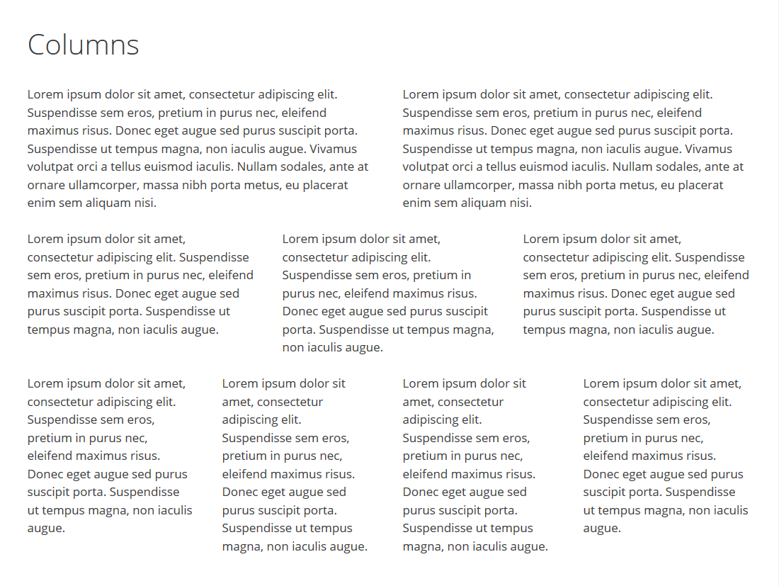
A look at some awesome columns!
How do I add the shortcodes?
- Make sure Lightweight Grid Columns is activated.
- While editing your post or page, go into the “Visual Editor”.
- Look for the columns icon (see screenshots tab).
- Choose your desktop, tablet and mobile grid widths.
- If you’re adding the last column in a row, check the “Last” checkbox (this is important).
What if I don’t want to use the TinyMCE button?
Fair enough! Simply add the shortcode to your content.
For example, the below will output 4 columns on desktop, 2 columns on tablet and 1 column on mobile
[lgc_column grid="25" tablet_grid="50" mobile_grid="100"]Some content[/lgc_column]

[lgc_column grid="25" tablet_grid="50" mobile_grid="100"]Some content[/lgc_column]

[lgc_column grid="25" tablet_grid="50" mobile_grid="100"]Some content[/lgc_column]

[lgc_column grid="25" tablet_grid="50" mobile_grid="100" last="true"]Some content[/lgc_column]
Take note of our last column – see the last=”true” part? Don’t forget 😉
What are my options for percentages?
This is taken directly from (http://unsemantic.com):
There are grid classes named grid-x where “x” is a number that represents the percentage width of each grid unit. These cover multiples of 5, up to 100 (grid-5, grid-10 … grid-95, grid-100). There are also classes for dividing a page into thirds: grid-33 and grid-66 which are 33.3333% and 66.6667% wide, respectively.
Are there any other options I can use in the shortcode?
Yes!
You can use:
class
[lgc_column grid=”25″ tablet_grid=”50″ mobile_grid=”100″ class=”push-25″]Some content[/lgc_column]
style
[lgc_column grid=”25″ tablet_grid=”50″ mobile_grid=”100″ style=”padding-left:0px;”]Some content[/lgc_column]
equal_heights
By default, JS equal heights are set to “true”.
[lgc_column grid="25" tablet_grid="50" mobile_grid="100" equal_heights="true"]Some content[/lgc_column]
ChangeLog
1.0
- Move custom class value to the parent container
- Code cleanup
0.7
- Fix weird scroll behavior caused by transitions and matchHeight
- Only load matchHeight on pages where columns are present with it enabled
0.6
- Fix column class bug causing some columns not to work
0.5
- Move margin-bottom setting to inner element so style attribute can overwrite it
- Adjust lgc_columns_helper function to fix issue with
<p> and <br /> tags around the shortcode
- Add jQuery matchHeight to match the height of columns for better responsive user experience
- Reduce the file size of stylesheet considerably
0.4
- Show TinyMCE icon on all post types
0.3
- Fix bug where TinyMCE icon wasn’t showing up if SiteOrigin Page Builder and Black Studio TinyMCE Widget were activated together
- Add IE 7 & 8 compatibility
0.2
- Allow line breaks inside columns
0.1