Fully responsive Bootstrap 5 blocks, components and extends for Gutenberg
Fully responsive Bootstrap 5 blocks, components and extends for Gutenberg
Now you can use Gutenberg editor as full-featured website builder.
Thanks to Bootstrap 5 – the world’s most popular front-end open source toolkit – you can build your layouts in 6 different breakpoints, so they will work perfectly on each device, no matter if your website visitor is on the phone, tablet, laptop or desktop.
You can use Bootstrap row and columns blocks with detailed settings for each breakpoint and autocomplete extension for bootstrap classes
- Option to load Bootstrap 5 css to editor from plugin if your theme doesn’t contain it
- Option to load Bootstrap 5 css to frontent from plugin if your theme doesn’t contain it
- Option to load Bootstrap 5 js to frontent from plugin if your theme doesn’t contain it
- Option to automatically add .container class to inner container of fullwidth group or cover block
- Option to remove .is-layout-constrained class from fullwidth group block
- Custom breakpoints control – add, remove or change any breakpoint
- Optimize Bootstrap CSS file by disabling not needed options and parts of Bootstrap
- Bootstrap container block
-
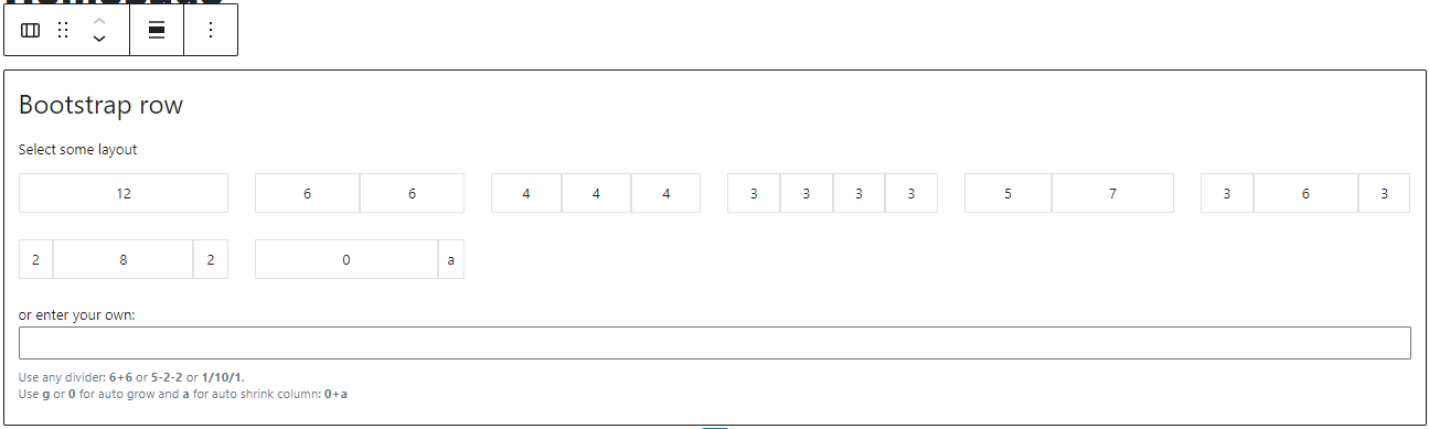
Bootstrap row block
- Use quick selector to instantly select row while editing
- Use predefined layouts
- Generate custom layout instantly just by adding columns counts, eg. 2+8+2
- Use any amount of columns
-
Use 6 different breakpoints to setup:
- Vertical alignment (align-items-*)
- Horizontal alignment (justify-content-*)
- Gutter (g-*)
- Row columns (row-columns-*)
-
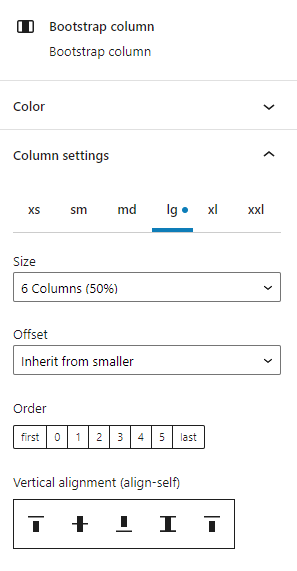
Bootstrap column block
- Use quick selector to instantly select column while editing
-
Use 6 different breakpoints to setup:
- Size (col-*)
- Offset (offset-*)
- Order (order-*)
- Vertical alignment (align-self-*)
-
Bootstrap accordion block
- Two styles – default and flush
- Always open option
- First open on load option
- Unlimited amount of accordion items
- Unlimited accordion item inner blocks content
-
Bootstrap tabs block
- Three styles – tabs, pills and text
- Possibility to reorder tabs
- Possibility to add and remove tabs
- Unlimited amount of tabs items
- Unlimited tab item inner blocks content
- Component for margin and padding Spacing for any block for 6 different breakpoints
- Component for Display visibility – display per breakpoints, print display, logged in/out display
- Component for Flex properties – control flex containers and item
- Component for Position properties – control position and z-index
- Component for Snapping for group block, so you can push some content out of container (or just background)
- Component for Alignment, so you can align your text to the left for PC but to the center for mobile
- Component for autocomplete Bootstrap classes
- Extended formats – uppercase, capitalize, lowercase, stretched-link, mark, non-breaking space (nbsp) and soft-hypen (shy) inserter
- Extended shortcuts – shift+alt+[1..7] to switch between paragraph and headings levels – same as in classic editor (tinymce wysiwyg)
Screenshots
ChangeLog
6.5.1
- fix missing tempID attribute for ServerSideRender component
6.5
- tested on WP 6.5
- PRO ONLY: new Block Editor settings section in plugin settings
- PRO ONLY: option to automatically select inner paragraph block when container block is inserted
- PRO ONLY: option to automatically center single column from smallest breakpoint when row is inserted
- PRO ONLY: top-right editor menu option to Show / Hide bootstrap spacing indicators
6.4.6
- fix dismissible PRO banner
6.4.5
- prepare for PRO version
- fix console warnings
- minor fixes
6.4.4
- new Bootstrap configuration tab section “Other SCSS overrides” allows you to specify your own Bootstrap SCSS variables values
6.4.3
- new Experiments tab where you can try to load only separate needed JS files for Bootstrap components to reduce unused JS code
6.4.2
- added link to Bootstrap documentation in Bootstrap configuration admin screen for Options
- added helper texts in Bootstrap configuration admin screen – just hover on Imports title or individual Imports items to see what they contains
6.4.1
- fix previews for site editor templates
6.4
- tested on WP 6.4
- removed loadash script dependency
6.3.1
- fix tabs on focus activation
6.3
- tested on WP 6.3
- skipped version 6.2 – from now on the plugin version first two numbers will be same as the current WordPress version
- fixed CSS variables –snap and –bs-offset for smallest devices – they were twice as big
6.1
- === BREAKING CHANGES FOR TABS !!! with easy fix:
- TO FIX TABS IN EDITOR USE THE “Attempt Block Recovery” BUTTON, BUT IT WILL WORK ONLY FOR PARENT TABS WRAPPER
- TO FIX TABS ITEMS THEN, JUST MOVE ANY TAB ITEM TO LEFT OR RIGHT AND IT WILL FIX ALL THE TABS ITEMS AUTOMATICALLY ( “Attempt Block Recovery” button will not work for tabs items )
- you can then move the tab item back of course
- REASON: tabs now have generated unique IDs, so it will never have an duplicated ID or missing ID because of non-latin characters
6.0
- newly created container has default paragraph block
- added controls for position and z-index
- remove redundant dependencies and imports in JS
- optimize code
5.0
- added controls for flex containers and items
4.0
- optimize for new theme.json themes
3.0
- Bootstrap 5.2.3
- new custom breakpoints control
- new admin to configure Bootstrap and recompile SCSS
- new container block
- new option to disable .is-layout-constrained class for fullwidth group block
- new option to disable .container class for fullwidth group block and cover block
2.5
- Bootstrap 5.2.2
- render spacing CSS in head instead of body
- enable custom classes for all blocks
2.4
- autofocus input when row block added
- fix custom attributes for ServerSideRender
2.3
- fix group inner container inside nested groups for WP 6.0
2.2
- tested on WP 6.0
- fix missing accordion item ID for first save
- added option to set accordion item collapse button wrapper tag for SEO reasons
- added indicator for elements with custom margin or/and padding in editor
2.1
- change accordion item ID logic to prevent duplicate IDs – you may need to click on Attempt Recovery
2.0
- fix group inner container inside nested groups for Gutenberg 12.9
1.9
- fix group inner container for Gutenberg 12.9
1.8
1.7
- tested on WP 5.9
- fix blocks metadata to make it works with block managers
1.6
- instant breakpoint tab switch on all open and closed instances
- fix col- class to col for xs auto grow
1.5
- remember selected breakpoint tab
- fix __experimentalUseInnerBlocksProps for Gutenberg 11.9+
1.4
- Bootstrap 5.1.3
- fix stretched-link className check
1.3
- always load bootstrap-blocks css
- new Layout control for Tabs (vertical/horizontal)
- fix tabs text style appearance for older browsers
- fix type check for bsSpacing, bsAlignment, bsSnapping, bsDisplay – issue with widgets
- optimized for FSE – snapping – getBoundingClientRect error
- optimized for FSE – spacing – universal CSS selector
- optimized for FSE – tabs – remove href=”#” on links in editor
1.2
- new display property extension – display per breakpoints, print display, logged in/out display
- new text format uppercase
- new text format lowercase
- new text format capitalize
- new text format stretched link
- new toolbar button for Nonbreaking space
- new toolbar button for Soft hyphen
- move left/right controls for tabs
- global shortcuts shift+alt+[1..7] to switch between paragraph and headings levels – same as in classic editor (tinymce wysiwyg)
1.1
- new Alignment controls
- new Accordion block
- new Tabs block
- fix snapping in editor
- load bootstrap css earlier in the editor, so it will not override user editor styles
- fix media queries order for Spacing in editor
- replace cover block and group block inner container with bootstrap container
- optimize JS code
- tested on WP 5.8
1.0