
Displays a responsive image with an optional link. An easy way to place reliably scaled images in the sidebar or other widget area.
| Author: | Benjamin Robinson, Keokee Creative Group (profile at wordpress.org) |
| WordPress version required: | 3.0.1 |
| WordPress version tested: | 3.5.2 |
| Plugin version: | 1.4 |
| Added to WordPress repository: | 09-07-2013 |
| Last updated: | 22-07-2013
Warning! This plugin has not been updated in over 2 years. It may no longer be maintained or supported and may have compatibility issues when used with more recent versions of WordPress.
|
| Rating, %: | 84 |
| Rated by: | 5 |
| Plugin URI: | http://keokee.com |
| Total downloads: | 23 858 |
| Active installs: | 900+ |
 Click to start download |
|
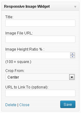
A very simple widget that displays a single responsive, rationally proportional image in a widget area. Intended to make adding images (whose proportions are important) to sidebar areas easier for non-technical users who would have trouble using the text widget to insert images into the sidebar.
One of its key features is the fact that it allows proportional adjustment on the fly, so the user can easily change the proportion of the image inside of WordPress, instead of needing to resize the image in an editor (a problem for many users who do not have a lot of experience resizing/cropping images.) Basically, it creates a frame for an image rather than adding an image directly, and the frame size can be set before the image is added, much like in Adobe inDesign, where frames can be laid out and then have pictures inserted into them.
It takes a title, image URL, ratio and target link URL. It outputs a rationally proportional div with the image set as a background. Using the CSS background-size and background-position properties, the image always fills the whole space and remains centered.
Note: the image always fills the width of its container. If the widget/widget area where the image is placed is large, the image will appear large.
Screenshots
FAQ


ChangeLog