
Automatically makes the HTML tables in your posts and pages responsive (mobile-friendly).
Automatically makes the HTML tables in your WordPress posts, pages, and widgets responsive (mobile-friendly). Devices with a small screen will see the tables in a new layout with two columns. In the first column will be the data from the first row (the column names), and in the second column will be the data from the other rows.
WordPress Plugin Demo
https://nikolaydev.com/demo-of-make-tables-responsive/
HTML and CSS Demo for Non-WordPress Sites
https://nikolaydev.com/make-tables-responsive-html-and-css-example/
Features
- Affect post/page content, excerpts, category descriptions, and text/HTML widgets
- Choose affected screen size
- Choose the cell background and border color for even and odd rows
- Disable for tables by HTML class or ID
- Disable or enable only for posts and pages by ID
Pros ????
- Fully automatic
- Does not change the actual post/page content in the database
- Easily reverse changes by deactivating the plugin
- No jQuery or JavaScript on the front-end
Cons ????
- The first row must contain the column names
- Skips tables with merged cells
- Skips posts/pages with tables inside tables
- Skips multi-row tables when only some columns use “th” tags
- In multi-row tables, HTML code is stripped from the cells with the column names, when displayed in the responsive version (as the left column)
Screenshots
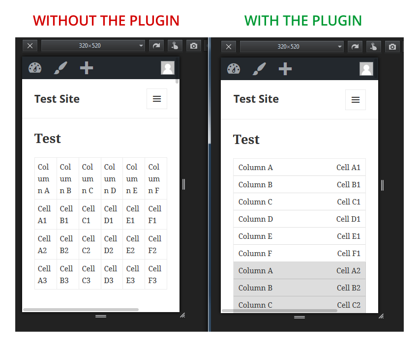
Using the Firefox responsive design view tool to see how a HTML table looks like without the plugin and with the plugin.
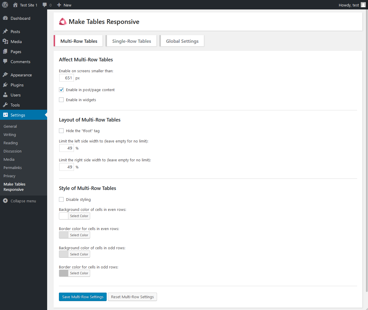
The multi-row tables settings tab.
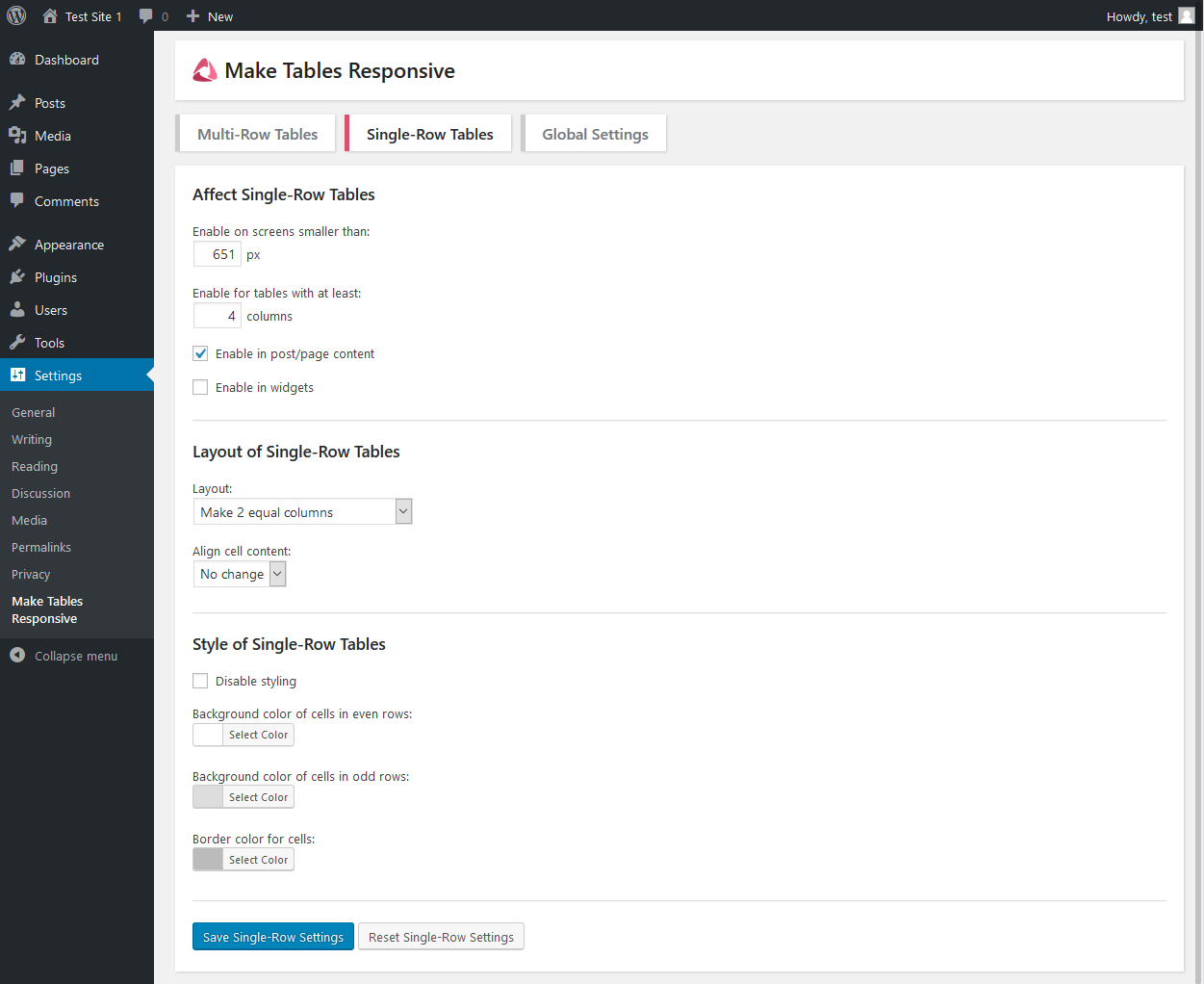
The single-row tables settings tab.
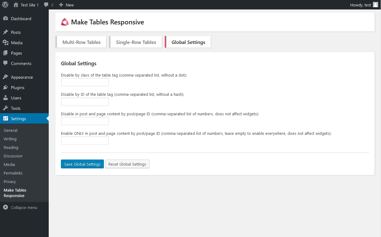
The global settings tab.
Why it is not working?
If the plugin sees any tables that it does not support, it will skip them, leaving them unchanged. See the cons section above, for more details. If you still need help, use the support forum.
ChangeLog
1.8.0 – 1 April 2024
- Recommended action: Check if your non-English or special characters are still showing correctly in the tables after this update. New encoding function is used.
- Fixed: Deprecation notice in PHP 8.2. PHP Deprecated: mb_convert_encoding(): Handling HTML entities via mbstring is deprecated.
1.7.0 – 31 October 2023
- Added: Option to affect output created by a shortcode callback (filter do_shortcode_tag). Enable this if your site content does not go through the default the_content filter. For example Oxygen Builder works like that.
- Fixed: Styling code displayed as normal text in sites using Oxygen Builder.
- Updated: Language file.
1.6.1 – 23 September 2023
- Fixed: Apostrophe character shown as its HTML entity in the column name of the mobile table in some cases (probably when wptexturize is disabled).
1.6.0 – 25 June 2023
- Added: Option to enable the plugin for the excerpt.
- Added: Option to enable the plugin for the category descriptions.
- Updated: Language file.
1.5.10 – 15 March 2023
- Fixed: The disable by parent class would not work if there were multiple exact same tables on the page and only some had the parent class.
1.5.9 – 14 March 2023
- Added: A global option to exclude all tables without a header section (a thead tag).
- Fixed: We now hide all admin dashboard notices on the plugin settings page, because they can break the layout and take up space.
- Updated: Language file.
1.5.8 – 19 July 2022
- Added: An option for multi-row tables, to enable the effects of the plugin only for tables with at least X columns.
1.5.7 – 24 October 2021
- Added: An option to align the content of the right side of the responsive table to the left.
- Updated: Language file.
1.5.6 – 23 August 2021
- Added: An option to exclude tables by parent element class. Useful for tables created in the block editor (they add their additional classes to the parent figure HTML element).
- Updated: Language file.
1.5.5 – 4 May 2021
- Added: An option to show a vertical separator line between the two columns in the multi-row table layout.
- Updated: Language file.
1.5.4 – 19 April 2021
- Fixed: A fatal PHP error caused by division by zero in some situations.
1.5.3 – 6 August 2020
- Fixed: A fatal PHP error when Multibyte String is not supported by the server. Now it shows an error in the admin notice area instead.
1.5.2 – 13 July 2020
- Fixed: Problem showing an ampersand in the column names.
1.5.1 – 15 May 2019
- Fixed: Layout problem when colgroup tag is used to set width of the columns.
1.5.0 – 4 May 2019
- Added: An option to put the column names on the right side (suitable for RTL languages).
- Updated: Language file.
1.4.1 – 7 April 2019
- Fixed: The support for AMP optimized sites with AMP for WP is fixed to not cause an AMP validation error and uses the correct hook for custom CSS.
1.4.0 – 1 March 2019
- Added: Support for AMP optimized sites with AMP for WP.
- Fixed: Various layout problems in some situations.
1.3.1 – 9 February 2019
- Improved: Changed the wording on some text in the plugin description in the readme.txt file and added a section for pros.
- Fixed: Double borders in some situations.
- Fixed: If you take the changed HTML code of a table from the front-end and use it in a post/page, now the changes are not applied twice. But still do not do that.
- Fixed: Added the !important CSS rule on some single-row CSS properties, so our layout is better forced over the existing one.
1.3.0 – 10 January 2019
- Added: Support for single-row tables.
- Added: Support for tables in text widgets and custom HTML widgets (and possibly some third party widgets).
- Added: New separate settings tab for single-row tables.
- Added: A link to the settings page in the plugin action links on the Installed Plugins page.
- Added: My author URI in the plugin meta data.
- Improved: Better looking design of the settings page.
- Improved: Shorter description of the limitations in the readme.txt file, so people read them more.
- Fixed: Missing table borders on the left, right and sometimes top.
- Fixed: A problem in the layout when the original table has a defined height of the rows or cells. Now we force an automatic height.
- Updated: Language file.
- Updated: Screenshots of the settings page.
1.2.0 – 1 January 2019
- Added: An option to hide the “tfoot” tag from the responsive version of the tables.
- Improved: The explanation of the current limitations of the plugin in the Readme.txt file.
- Fixed: Sometimes we could not detect that there is a table inside a table (we still skip the whole page/post when we do).
- Fixed: We didn’t detect merged cells in “th” tags. Now we detect them and skip the table (since we still do not support them).
- Fixed: Incorrect detection of the column names and count when “th” tags are used somewhere in the table but not in the first row.
- Fixed: We now skip tables that have “th” tags only in some columns.
- Fixed: We now support tables that use “th” tags in whole rows even if it is not the first row (and on other rows use “td” tags).
- Fixed: Sometimes the plugin skipped a table that is supported.
- Updated: Language file.
1.1.2 – 31 October 2018
- Fixed: How tables with just one row are handled. The plugin still does not support those, but instead of them disappearing on smaller screens, now the plugin just skips them and shows them unchanged.
1.1.1 – 27 June 2018
- Fixed: A missing closing curly bracket in the CSS code. It didn’t affect anything though, since the tag was closed after it anyway.
1.1.0 – 20 June 2018
- Added: The option to enable the responsive tables only on some chosen posts or pages.
- Added: The option to disable styling. This is useful if you are adding your own CSS code and my code is taking priority because it uses the !important rule.
- Improved: The wording on some options to be more clear.
- Fixed: A bug that caused a body HTML tag to be added inside the tables.
- Updated: Language file.
1.0.0
