
WordPress lightbox plugin is an high customizable and responsive product for displaying images and videos in popup. WordPress Lightbox plugin is one o
| Author: | wpdevart (profile at wordpress.org) |
| WordPress version required: | 3.4.0 |
| WordPress version tested: | 6.5 |
| Plugin version: | 2.1.6 |
| Added to WordPress repository: | 15-12-2015 |
| Last updated: | 03-04-2024 |
| Rating, %: | 68 |
| Rated by: | 10 |
| Plugin URI: | https://wpdevart.com/wordpress-lightbox-plugi... |
| Total downloads: | 181 864 |
| Active installs: | 2 000+ |
 Click to start download |
|
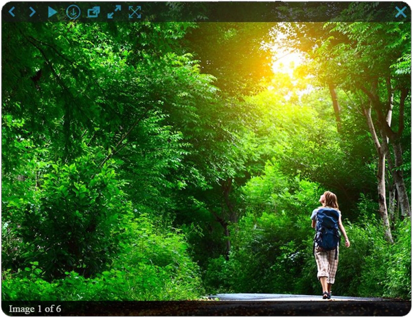
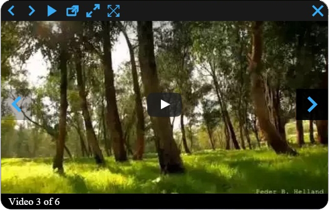
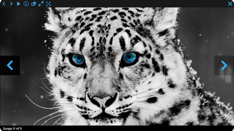
WordPress Image and Video Lightbox is an high customizable and responsive plugin for displaying images and videos in popup. You just need install our plugin and enable it.
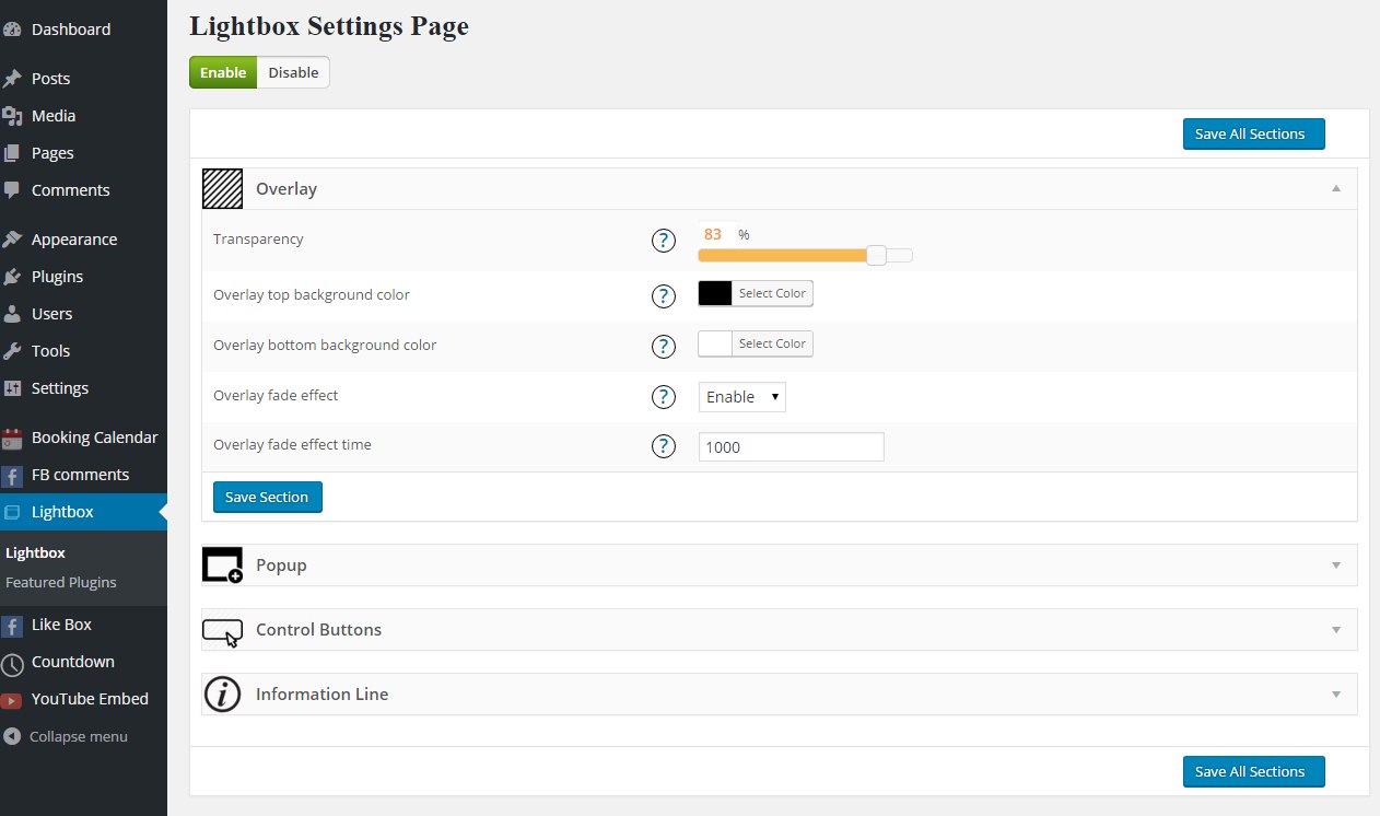
There are a lot of settings that will help you to configure what you need.
Check our plugin demo page here
If are using a lot of images and videos on your website then this plugin is an necessary one for you.
Our plugin have a lot of free and Premium features, here are some of them.
Features of free version
- Fully Responsive
- Handy admin panel and easy use
- Tested on all modern browsers
- Works perfectly with all versions of WordPress
- Image and Video lightbox
- Ability to set Popup background color, Initial Width, Initial Height, Max Width and Height, Position, Fixed position, Border color, Border radius and width, Opening type
- Overlay transparency
- Ability to upload loading thumbnail
- Ability to show Show/Hide Control Buttons in content or outside content
- Ability to set Control Buttons Line Background Color and Height
- Ability to change/upload all control buttons
- Ability to Show/Hide information panel
- Ability to show information panel inside content or outside content
- Ability to set information line background color and height
- Ability to change count text
- Ability to set Count, Description and Title sections padding left and right parameter, text font size
- Ability to Show/Hide default description text if the photo doesn’t have caption or title
- Ability to set default description text if the photo doesn’t have caption
- Ability to set default Title text if the photo doesn’t have title attribute
- Ability to set information line elements ordering
- Ability to hide Count, Description and Title sections
- Ability to download images
- User friendly back-end
- Tested on popular WordPress themes
You can upgrade the free version to Pro Version to add some great features.
The features of Pro version
- Popup opening 12 animation effects(animation duration)
- Nice Slideshow
- Ability to set Slideshow Time
- Ability to select animation type and duration
- Ability to use fullscreen functionality
- Ability to set overlay top background color
- Overlay bottom background color
- Control buttons line transparency and hover background transparency
- Ability to Enable/Disable left and right navigation buttons mouseover functionality
- Ability to Show/Hide left and right navigation buttons inside popup
- Ability to set Background color and transparency of left and right navigation buttons inside popup(aslo, when hovering)
- Ability to Show/Hide left and right navigation buttons in overlay
- Ability to set Background color and transparency of left and right navigation buttons(alos, in overlay when hovering)
- Count, Description and Title sections text font family(31 fonts), font weight, font style, color
- Information line transparency and hover transparency
- Ability to enable overlay fade effect
- Ability to set overlay fade effect time and Navigation line ordering
- Ability to order elements
- Ability to hide any navigation button
- Premium support
If you found any bug or mistake in our plugin or have a question contact us at support@wpdevart.com, we will be happy to fix it.
Overlay Settings
- Transparency – Set the transparency
- Top background color – Choose top background color
- Bottom background color – Choose bottom background color
- Fade effect – Enable/Disable fade effect
- Fade effect time – Set fade effect time
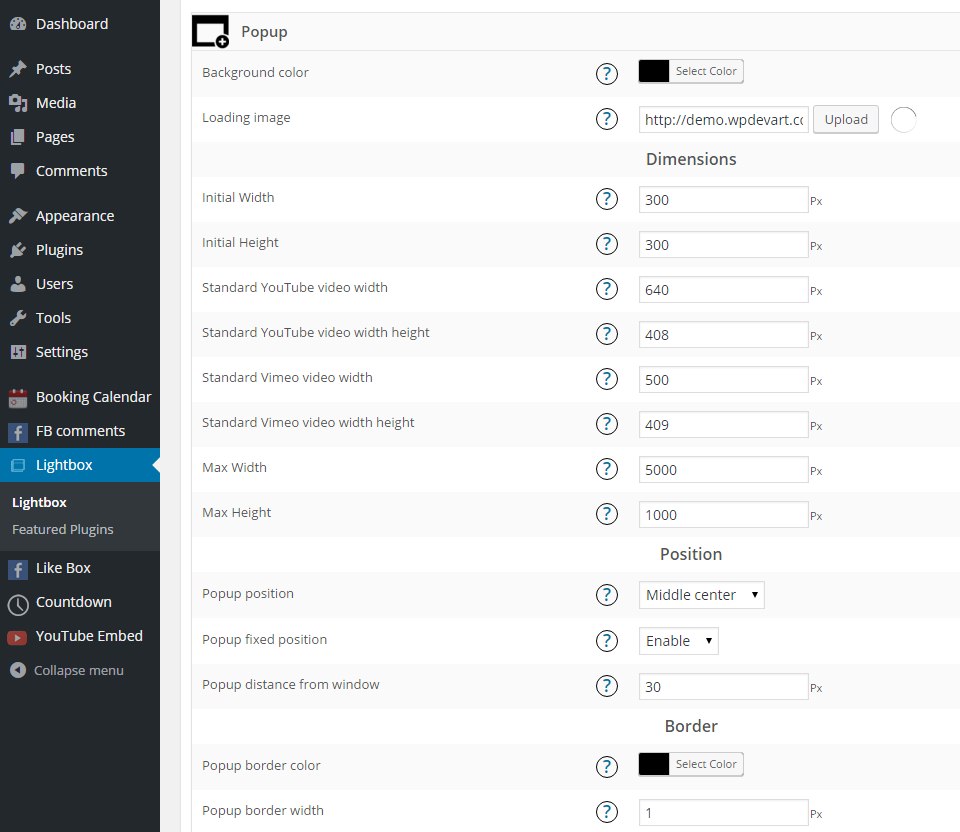
Popup Settings
- Background color – Set the background color
- Loading thumbnail(.gif) – Type the url or upload the .gif thumbnail
- Initial Width – Type initial width
- Initial Height – Type initial height
- Max Width – Type Max width for
- Max Height – Type Max height
Position
- Position – Select the position
- Fixed position – Enable/Disable fixed position
- Distance from window when position is 1,2,3,4,6,7,8,9 – Type distance from window when position is 1,2,3,4,6,7,8,9(except Middle center position)
Border
- Border color – Set the border color
- Border width – Type the border width
- Border radius – Set the border radius
Animation
- Opening type – Choose the opening type
- Opening animation type – Choose opening animation type
- Animation duration – Choose duration of animation
Elements ordering
- Elements ordering – Set the ordering of elements
Control Buttons Settings
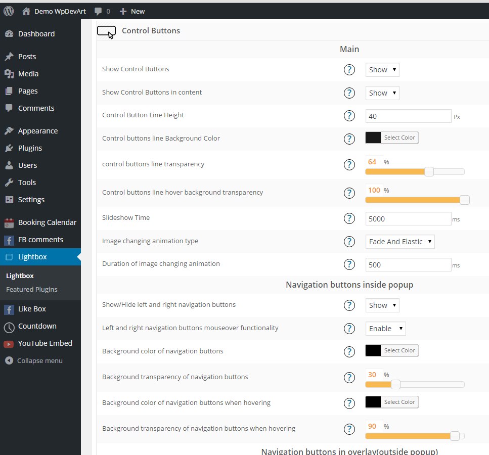
Main
- Show Control Buttons – Show/Hide control buttons
- Show Control Buttons in content – Show/Hide control buttons in content
- Control Button Line Height – Type Control Button Line Height
- Control buttons line Background Color – Choose control buttons line background color
- Control buttons line background transparency – Set control buttons line background transparency
- Control buttons line hover background transparency – Set control buttons line hover background transparency
- Show/Hide left and right navigation buttons inside popup – Choose to show or hide left and right navigation buttons
- Enable/Disable left and right navigation buttons mouseover functionality – This functionality will show left and right navigation buttons only when you navigate with your mouse on photo, if you disable it then your navigation buttons always will be active
- Show/Hide left and right navigation buttons in overlay – Choose to show or hide left and right navigation buttons in overlay
- Background color of left and right navigation buttons in overlay when hovering – Set the background color of left and right navigation buttons in overlay when hover
- Background transparency of left and right navigation buttons in overlay when hovering – Set the background transparency of left and right navigation buttons in overlay when hover
- Slideshow Time – Type the Slideshow Time
- Animation type – Select the animation type
- Duration of animation – Type duration of animation
Images
- Previous img(icon), Next img(icon) inside popup
- Previous img(icon), Next img(icon) in overlay
- Previous img(icon)
- Previous img(icon) when hovering(optional)
- Next img(icon)
- Next img(icon) when hovering(optional)
- Play img(icon)
- Play img(icon) when hovering(optional)
- Pause img(icon)
- Pause img(icon) when hovering(optional)
- Download img(icon)
- Download img(icon) when hovering(optional)
- Open in new window img(icon)
- Open in new window img(icon) when hovering(optional)
- Full width img(icon)
- Full width img(icon) when hovering(optional)
- Full width reset img(icon)
- Full width reset img(icon) when hovering(optional)
- Full screen img(icon)
- Full screen img(icon) when hovering(optional)
- Full screen reset img(icon)
- Full screen reset img(icon) when hovering(optional)
- Close img(icon)
- Close img(icon) when hovering
Ordering
- Navigation line ordering – Set the navigation line ordering
Information Line Settings
- Show information panel – Choose to show/hide information panel
- Show information panel in content – Show information panel inside or outside content
- Information line height – Type information line height
- Information line background color – Choose information line background color
- Information line transparency – Set the information line transparency
- Information line hover transparency – Set the information line hover transparency
- Count text – Type the count text
Count
- Count section padding left – Type the count section padding left
- Count section padding right – Type the count section padding right
- Count section text font size – Type the count section text font size
- Count section text font family – Select the count section text font family
- Count section text font weight – Select the count section text font weight
- Count section text font style – Select the count section text font style
- Count section text color – Set the count section text color
Description
- Description section padding left – Type the description section padding left
- Description section padding right – Type the description section padding right
- Description section text font size – Type the description section text font size
- Description section text font family – Select the description section text font family
- Description section text font weight – Select the description section text font weight
- Description section text font style – Select the description section text font style
- Description section text color – Set the description section text color
- Default description text if the photo doesn’t have caption – Type the default description text if the photo doesn’t have caption
Title
- Title padding left – Type the title padding left
- Title padding right – Type the title padding right
- Title font size – Type the title font size
- Title font family – Select the title font family
- Title font weight – Select the title font weight
- Title font style – Select the title font style
- Title color – Set the title color
- Default Title text if the photo doesn’t have title attribute – Type the default title text if the photo doesn’t have title attribute
Ordering
- Information line elements ordering – Set the information line elements ordering
Screenshots
FAQ
ChangeLog